Welcome to the Living on the Edge Brand Style Guide.
We see every piece of communication as an extension of our mission to deliver catalytic, biblical teaching to build disciples around the world. Our brand is much more than a logo, a specific font selection, or a color palette; it is the visual and verbal expression of our commitment to authenticity, biblical truth, and discipleship. When we maintain a unified and consistent brand presence across all platforms — from print materials and digital media to the broadcast — we build a reliable bridge of trust with our global community, ensuring that our core message remains clear, undistracted, and profoundly impactful, to help Christians live like Christians.
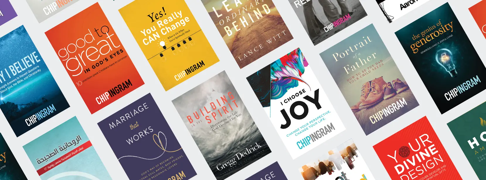
Our Mission
We are a catalytic ministry that equips followers of Jesus worldwide to become Romans 12 Disciple Makers.
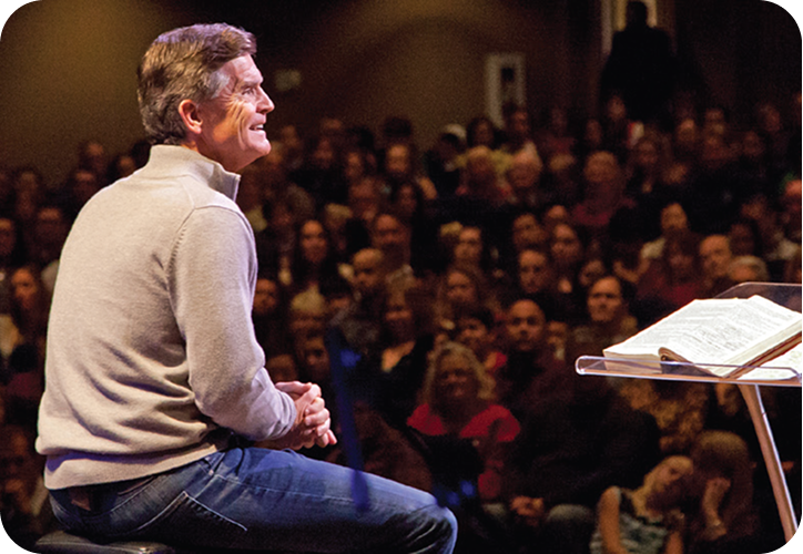
Our Vision
To see a global movement of Christians living like Christians for the glory of God and the good of all.

Primary Logos
Our logo is built from two elements — the “Edge” icon and the “Living on the Edge” word mark. It can appear in the brand colors, black, gray, or white. To accommodate varying layouts and spatial constraints, the primary logo is designed to function in two orientations:
- VERTICAL (STACKED): The preferred layout for centered compositions, merchandise, and vertical layouts.
- HORIZONTAL: The preferred layout for banners, headers, and wide aspect ratios where vertical space is limited.








Logo on Backgrounds
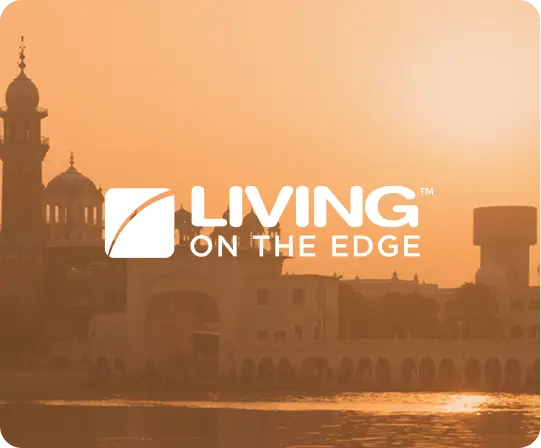
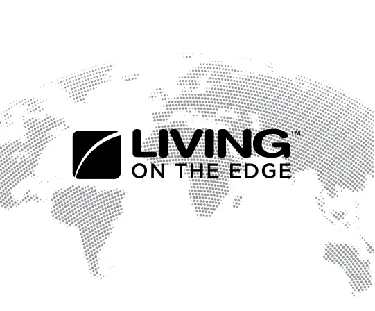
Placing our logo over photographic backgrounds requires care — keep the mark and type legible and never let the image obstruct them. In most cases use a solid white, navy, or black logo over the image.
Examples of usage:
Standalone Icon Usage
While the full logo lockup (logo plus brand name in the approved fixed position) is our primary signature, the “Edge” icon may be used entirely on its own under specific circumstances. Using the icon independently allows for clean, modern aesthetics, but it requires care to ensure we don’t lose brand recognition.
Approved Applications. In most cases, the standalone icon should be used in contexts where the Living on the Edge brand has already been clearly established nearby.
Usage Rules — Prior Brand Establishment. In most cases do not use the standalone icon as the very first brand touchpoint for an external audience. Ensure the full word mark appears in a place of greater prominence on the piece (e.g., the header of a website, the back of a postcard, or the closing slide of a video).
When in doubt, default to the full vertical or horizontal logo. The icon by itself is an accent, not a replacement for our ministry name.
Examples of usage



Clear Space
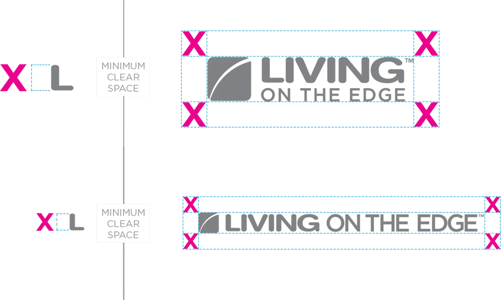
The logo is always surrounded by a minimum amount of buffer space in which no other competing graphic element may intrude, regardless of the background. The amount of clear space required is proportional to the height of the uppercase “L” on every side.
Colors
With a diverse array of colors expressed throughout our products and programs, maintaining a disciplined and consistent color palette is vital to clearly establishing the Living on the Edge brand identity. By intentionally limiting our color usage, we do more than reinforce a cohesive, premium aesthetic across all touchpoints — we establish an instant, unmistakable visual shorthand that lets audiences recognize a Living on the Edge product at a single glance.
Click any color to copy its HEX code.
Typography
Branding Fonts
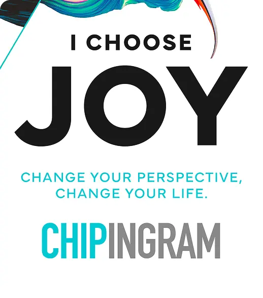
There are three primary typefaces emphasized in many of the Living on the Edge products and marketing tools, each serving different purposes. The primary serif font is Adobe Garamond, used for body text, long-form reading, curriculum, and trade book materials. Gotham serves as our primary sans-serif typeface, ideal for headlines, subheads, and digital interfaces. Finally, DIN Condensed is a secondary sans-serif with a vertical posture, featured most prominently in the Chip Ingram name plate for book and podcast covers.
The glory of God and the good of all.
Living like Christians, for the good of all.
LIVING ON THE EDGE
Examples of usage
Brand per Language
When adapting the logo for different languages, the “Edge” icon always remains untouched as our universal visual anchor. The “Living on the Edge” word mark may be translated into the native language of the target region using approved, localized typography. These translated lockups must adhere to the same orientation, color application, and background legibility standards outlined in this guide.







Brand by Region/Country
Beyond direct translation, certain regions and countries call for localized lockups that account for cultural and typographic context. The “Edge” icon remains the constant anchor, while regionally approved word marks are paired with it following the same orientation, color, and legibility rules used everywhere else in this guide.






Brand Usage
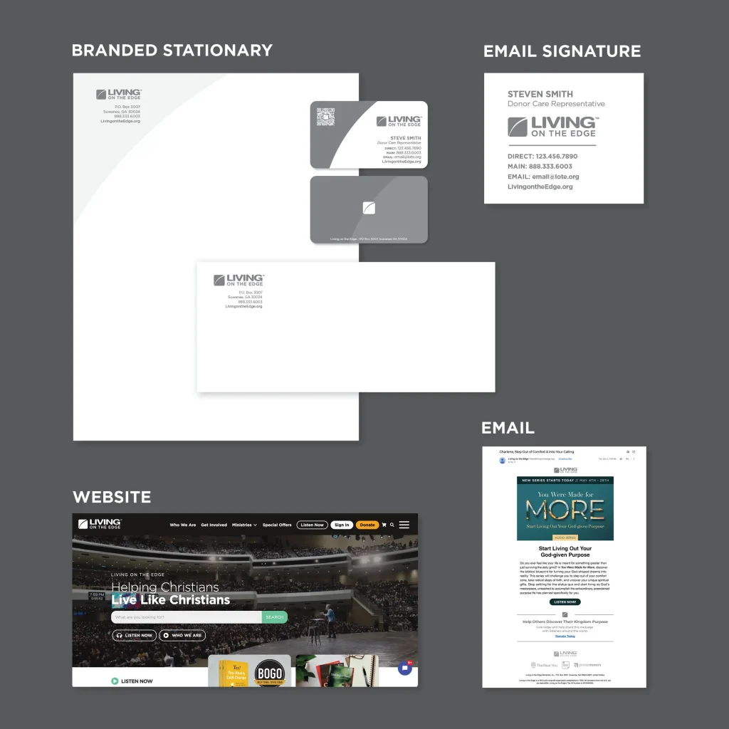
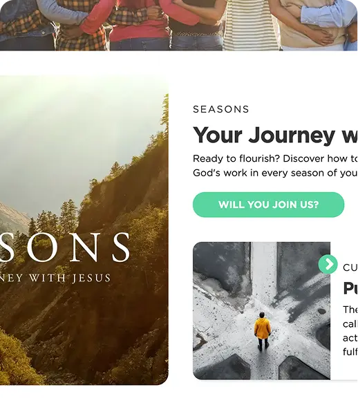
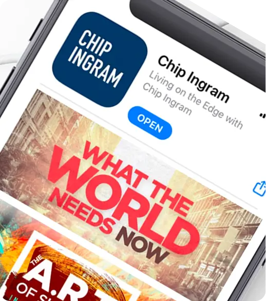
How the brand comes together in the real world — across print, digital, broadcast, merchandise, and social. Use these examples as a reference for tone, spacing, and the relationship between the mark, type, color, and photography.
Examples of Usage